
The Role of Color Palettes in Scandinavian Design
Scandinavian design is known for its soft neutrals and muted tones—but it also embraces bold colors and patterns. See how to balance both to create a fresh, inviting space.
What is a Color Palette?
A color palette, or color scheme, is the guide that designers use when choosing colors for an interior. It determines not only the colors to be used, but the proportions of each color. Using exactly equal amounts of each color in a room can look unnatural; most designers, therefore, will use one main color and differing amounts of accent colors to achieve visual harmony.
Some designers go by instinct alone to determine these proportions, but others will use mathematical ratios such as 60:30:10, which is based on the “golden ratio” developed by the ancient Greeks and often found in nature. As a general guide:
- 60 percent comprises the main color (often a neutral or muted color) used on the walls, floor, and large items of furniture.
- 30 percent comprises the accent color used on curtains, rugs, and small items of furniture.
- 10 percent comprises another (usually a deeper, more vivid and/or contrasting) accent color used on wall art, cushions, and ornaments.
This isn’t a hard rule but can be helpful when you’re stuck. Another version of this rule is 60:30:10 + B/W, where “B/W” refers to a small black or white detail that ties the other colors together. Within your selected colors, you will also use different tints, tones, and shades (more on that here) ending up with around seven to nine colors in total.

How Color Palettes Are Created
There are two main methods used to create color palettes: 1) color theory, and 2) external inspiration. Color theory uses the color wheel developed over centuries by many eminent scientists—including Isaac Newton—and selects colors using ratios known as color harmony rules. There are far too many rules to name here, but the most common are complementary (colors from opposite sides), analogous (colors next to one another), and monochrome (colors of the same hue, but of different saturation and brightness levels). To see these in action, try making your own color schemes on Adobe Color.
The second method is perhaps more relevant to Scandinavian design: inspiration. To use this method, you simply pick something that you like—an artwork, a flower, a wallpaper sample, a patterned throw, or a photograph—and design your space based on these colors and their proportions. Curiously, these items often naturally follow color theory and the golden ratio, showing just how embedded these rules are in nature and art.
Nordic Neutrals: a Common Misconception
Type “Scandinavian design” into any image search engine and you’ll be faced with page upon page of white and gray rooms. While these colors do play a significant role in Scandinavian design (particularly Swedish design—more on that below), they are by no means the only colors you’ll find here. The three Scandinavian countries of Sweden, Denmark, and Norway do have many design principles in common such as simplicity, functionality, and sustainability, but their color palettes are more varied than you’d think.

Sweden: From Royal Opulence to Light, Bright Minimalism
Of the three Scandinavian nations, Sweden most closely follows the “Scandinavian design” archetype you’ll see in US media, with white, gray, and pastel tones. Given its minimalist tendencies, you might be surprised to learn that this style originated in a royal palace.
The Gustavian Style period corresponded with the reigns of King Gustav III of Sweden and his son, King Gustav IV Adolf, from 1771 to 1809. King Gustav III had a keen sense of aesthetics and modelled the Royal Palace on the Neoclassicism he saw on his travels in Italy and France. Though ornate by today’s standards, Gustavian style was a reaction to the perceived excesses of Rococo: lines became cleaner, furniture legs became straighter, and dark mahogany was replaced with light-reflecting brass.
Color-wise, the Gustavian style evoked a bright, airy feeling and used plenty of white and gray along with pale, powdery blues, pinks, and greens. This timeless color palette has endured to this day, in modern Swedish homes and with brands such as Asplund and Norrgavel.
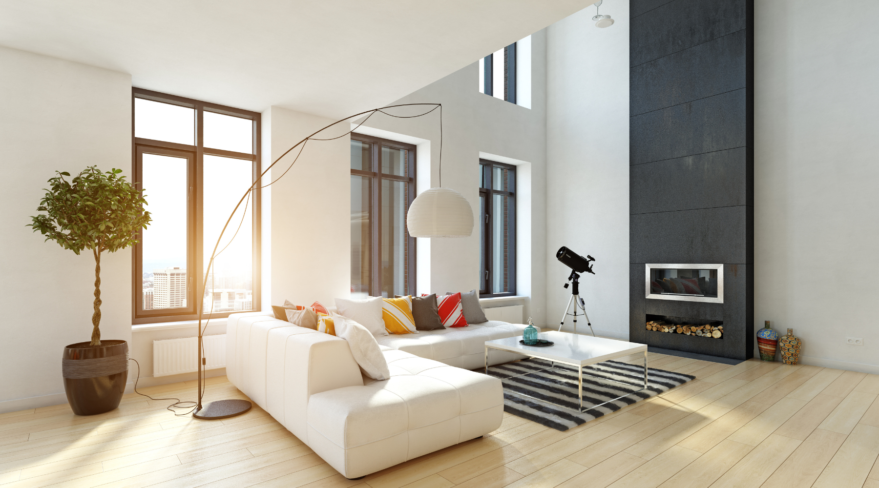
Denmark: a Bold Statement
Danish designers are known for experimentation. As such, it’s difficult to describe the Danish color palette in one neat sentence, but if we were to try, it would be: “expect the unexpected”. Since the time of Verner Panton, Danish designers have stepped out of the box with accents and color combinations that make no logical sense, yet somehow still work.

See, for example, the Arne Aksel x Flügger paint collection, new for 2025. This color palette follows no rules, nor reason, yet has undeniable appeal.
However, there are some overall trends worth noting. In general, you’ll find more light/dark contrast in Denmark than in other Nordic nations: the walls are still white, but they’re offset by dark or even black statement pieces. There is also a tendency towards warm and earthy colors such as terracotta, to evoke a feeling of coziness and hygge.
Want to design like a Dane? Then our advice is: be fearless. Trust your instincts and pick accessories in colors that don’t necessarily adhere to design “rules.” This approach does carry risks, though, so we encourage you to buy second-hand to avoid potentially wasting money and resources.
Norway: Nature’s Law
Blue, green, more blue, more green… and maybe some white or gray. From a color perspective, Norwegian design is perhaps the easiest to grasp, as it draws inspiration from the country’s vast, epic landscapes. Think: deep fjords, pine forests, snow-capped mountains, and stormy clouds.

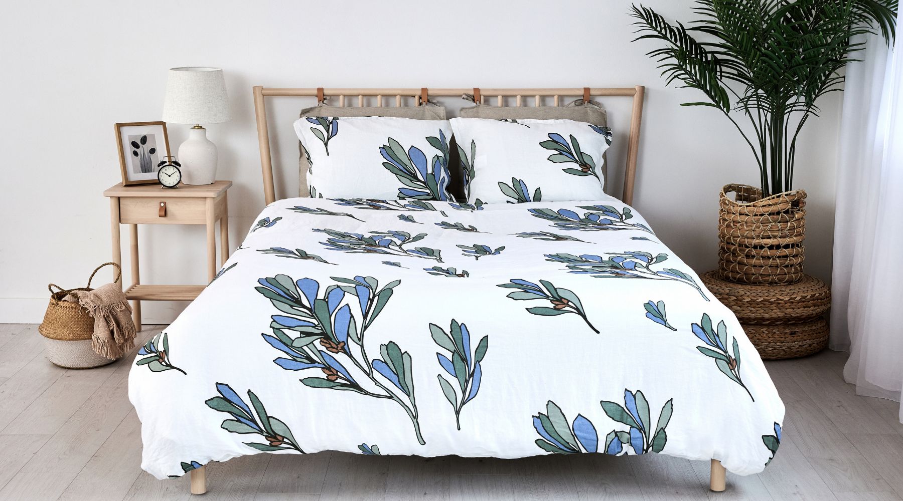
In fact, we’ve got just the thing to get you started: our organic linen bedding! Our solid-color European bedding sets perfectly complement the Norwegian palette or provide a calming anchor if you’re experimenting with wild, Danish-style paint colors. Going for a more Swedish look? Our Scandinavian-style duvet covers also come with nature-inspired prints on a neutral background, creating a focal point in an otherwise minimalist space.
Which Scandinavian color palette do you like best? What inspires you when creating color schemes for your home? Let us know on Instagram, Pinterest, Facebook or Twitter!
Read more
The Danish Art of ‘Lykke’: How Design Influences Happiness
Learn how lykke, the Danish notion of happiness, inspires Scandinavian design by prioritizing minimalism, coziness, and functional beauty.
Read more
Sustainable Living: Why Organic Linen is a Smart Choice for Eco-Friendly Homes
See why organic linen is an ideal choice for eco-friendly homes and how this sustainable fabric elevates your space while promoting a healthier planet.
Read more
Leave a comment
This site is protected by hCaptcha and the hCaptcha Privacy Policy and Terms of Service apply.