Scandinavian Design for Large Spaces
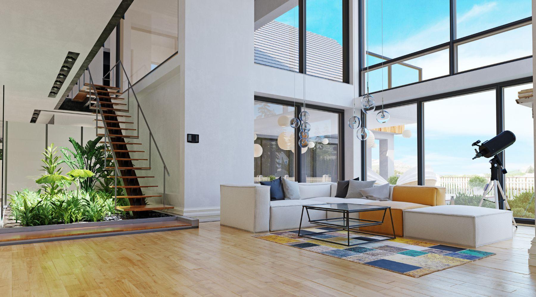
Scandinavian design was created for tiny apartments in Copenhagen and Stockholm—but the average American home is 2.4 times larger than the average Swedish one. Find out how to adapt Scandinavian design principles to make even large spaces feel cozy.
Scale Up
Large spaces need large things to fill them. Compare a detailed painting in an art gallery with a mural that covers an underpass: the mural painter must use broad brushstrokes or risk their message getting lost in the noise.
You need to apply a similar mindset to large spaces. Furniture may need to be bigger than you think—consult The Interior Design Handbook by Swedish designer Frida Ramstedt for specific guidance on sizing.
This advice also applies to accessories. Plants are essential to any Scandinavian home but will need to be tall or have big leaves, so they don’t disappear in your space. Ficus—either the perennially popular fiddle-leaf fig or its smaller-leaved cousin, benjamina—are an ideal choice. Other large plants include monstera (Swiss cheese plant), bird of paradise, and parlor palm.

Ornaments, too, should be to scale. LA-based interior designer Amber Lewis—who often designs massive celebrity homes—suggests displaying no ornament smaller than an apple. For a Scandi space, think natural and organic: reactive-glaze plates, wicker baskets, and hand-thrown pottery. Add candles for hygge but scale them up: pillar candles and tall candelabras rather than tealights.
One of the most vital—and overlooked—aspects of large-space design is lighting: specifically ceiling lights, which almost always need to be bigger than you think. Queer Eye design maestro Bobby Berk has a comprehensive guide to lighting on his blog, covering everything from sizing to where to hang it. You won’t be short on choice: Scandinavia has a rich tradition of lighting design, including Poul Henningsen’s Artichoke lamp and PH5 pendant. More affordable options include the DIY designs of Simon Karkov and HAY’s rice paper creations.
Berk’s other oft-cited tip—that curtains should be hung higher—is particularly relevant here. Hanging them a foot above the window will “fill” the wall more effectively, avoiding that odd “blank” look that’s so often the case in the upper portion of tall walls.
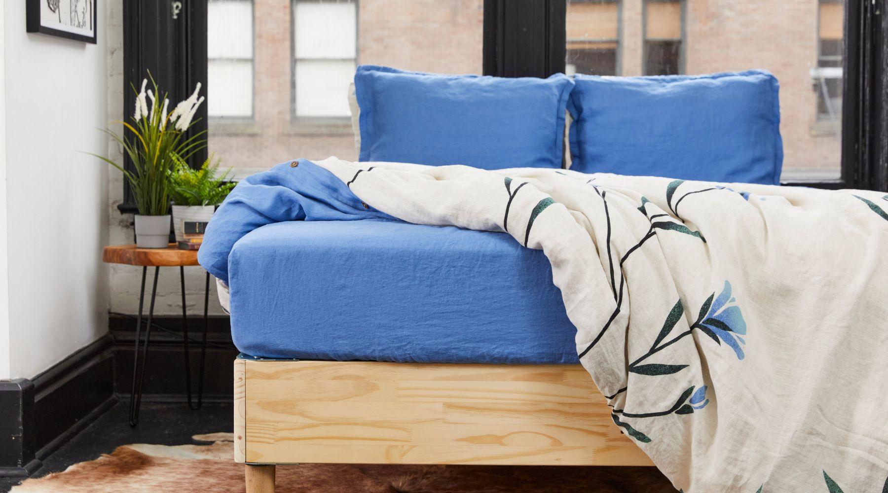
Finally, keep patterns on the larger side: small, fussy designs will get drowned out. Our picks include the huge flowers of Marimekko and—of course—the bold, nature-inspired designs on our Scandinavian-style duvet covers.
Use the Middle
In Scandinavian homes, sofas are usually flush with the walls. It’s got nothing to do with aesthetics: that’s simply the reality of living in a small house. Many people, however, continue to apply that principle upon moving to a larger home, resulting in an odd-looking living room with a huge space in the middle.
If something looks “off” in your living room, try moving the lounge suite—the sofa, armchairs, and coffee table—into the center of the room. It may feel counter-intuitive at first but the results may surprise you—and what do you have to lose? The worst that can happen is that you have to move everything back to where it was.
When it comes to rug sizing, common wisdom holds that only the front legs of your furniture should sit on the rug—but if your living room is particularly large, it will be more visually appealing to have the rug support the entire suite. Such rugs can be expensive, so look into cheaper natural materials such as jute—or use two smaller rugs size by side.

Zone Out
Open-plan spaces became a major trend over the last two decades, as Americans embraced a more sociable lifestyle—but this came at the expense of privacy and focus, as many discovered in lockdown. Putting walls back up isn’t affordable for most—fortunately, there are still things you can do.
The secret is to create “zones” within the space, treating each area as its own vignette while keeping the color scheme and design style consistent across the space. For example, a large bedroom might have the main sleeping area with the bed and nightstands, but also a separate “hyggekrog” reading zone with a comfortable chair, coffee table, and bookcase, as well as a vanity zone with a mirror and drawers.
Shelves, screens, and rows of plants can form “soft walls” to separate one zone from another. Add “hygge” items to each zone to make it cozy: squashy cushions, furs, candles—and of course, organic linen duvet covers.
Tips for Tall Walls
White is the most popular wall color in Scandinavia but it can make large spaces look even larger. On the other hand, dark or patterned colors can look overwhelming, as if the high walls are “caving in” on you.
The trick with tall walls is not to change the paint color but to break up the monotony of the walls. The most common way to do this is with artwork: check out Swedish brand Desenio for gallery wall inspiration. Gallery walls should be as high as the ceiling to avoid the “bottom-heavy” look so common to large spaces. Alternatively, you may wish to use just one or two large canvases.

Shelves also add character to walls. A living room or hall shelf can be used for books or a decorative “shelfie;” an over-the-bed shelf can support trailing plants. As with gallery walls, shelves should use the walls’ full height to be effective. If that’s not possible, place a tall plant or artwork on the top shelf to extend it to the ceiling.
Pendant lights are often used to balance out tall walls but they aren’t the only object that can be hung from the ceiling: hanging planters can be used for trailing pothos, philodendron, or ivy. Use them in the bedroom to complement our Scandinavian-design bedding.
Prefer to stick with just paint? Try the “two-tone walls” trend but with a Scandi twist: instead of bright colors, choose gray, pastel, and earth tones. You’ll break up the height without making it obvious.
Have you ever struggled with a large space? What are your decorating tips? Let us know on Instagram, Pinterest, Facebook, or Twitter!


Leave a comment
This site is protected by hCaptcha and the hCaptcha Privacy Policy and Terms of Service apply.